ShopDreamUp AI ArtDreamUp
Deviation Actions
Melrose's Misadventures
3 Subscribers
Melrose, who is my player character from Phantasy Star Online 2, is in various situations which put her in distress.
What to expect: Tied up girl, always the same character although she has a few fashion variations. Exceptions may apply occasionally. No explicit content.
This is basically the same as my Fanbox gallery, starting late but it has caught up.
$5/month


Suggested Deviants


Suggested Collections


You Might Like…


Featured in Groups

Description
And none too happy about it. XD
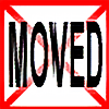
A commission for : *tazsaints of her Character/self insert Taz and Schatt's character Ace being caught by some grunts.
A few things about this. #1, I'm SUPER freaking proud of myself here. I think this is one of the best looking things I've done so far. It makes me feel great to be able to look at something myself and tell myself that I'm improving.
#2, I messed up a little bit in this picture. Those grunts in the back shouldn't be rocket grunts. OTL By the time I realize it I was all ready to color it in and finish it. Taz said she didn't mind though, so I went on ahead and finished the drawing. Don't let it bother you too much. ;u;
#3, The shading. D: Oh god... OTL I've never tried to shade something using a light source from such an... odd angle. It was my own fault though for designing the background the way I did, but I think, in the end, it gave it a nice feel. I'm probably waaaay off on how some things should have been shaded, but... ahaha.. I dunno what to say about that. ouo;;
Anywho, this was SUPER fun to draw. I totally ship these two SO hard. XD Thank you SO so much for the commission Taz. I REALLY hope you enjoy it. ;u;
Taz [link] belongs to *tazsaints
Ace/Julian [link] belongs to =Schattendorn
Commission info: [link]
A commission for :
*tazsaints of her Character/self insert Taz and Schatt's character Ace being caught by some grunts.A few things about this. #1, I'm SUPER freaking proud of myself here. I think this is one of the best looking things I've done so far. It makes me feel great to be able to look at something myself and tell myself that I'm improving.
#2, I messed up a little bit in this picture. Those grunts in the back shouldn't be rocket grunts. OTL By the time I realize it I was all ready to color it in and finish it. Taz said she didn't mind though, so I went on ahead and finished the drawing. Don't let it bother you too much. ;u;
#3, The shading. D: Oh god... OTL I've never tried to shade something using a light source from such an... odd angle. It was my own fault though for designing the background the way I did, but I think, in the end, it gave it a nice feel. I'm probably waaaay off on how some things should have been shaded, but... ahaha.. I dunno what to say about that. ouo;;
Anywho, this was SUPER fun to draw. I totally ship these two SO hard. XD Thank you SO so much for the commission Taz. I REALLY hope you enjoy it. ;u;
Taz [link] belongs to *tazsaints
Ace/Julian [link] belongs to =Schattendorn
Commission info: [link]
Image size
1600x1300px 772.69 KB
Comments41
Join the community to add your comment. Already a deviant? Log In
oh wow, this is absolutely amazing XD the focus is right on the characters and the perspective of the chair is great. I think the placement/composition of all the characters makes it pop. The colouring is great and the lines are some of your best. I would suggest much stronger shading for the grunts, as they're closer to the light source and it would make them more menacing. I think using a straight line for the door in the background and some thinner lines for the outline of it, would help. Going with grey for the inner lines there is good and the bit of shading on it is nice too. You could also bring down the line for the wall/foreground, somewhere below the guy's knees would probably bring things closer. I think I'm drawn to the two main faces the most, the features and the expressions are just spot on and play off each other perfectly. overall, this is GREAT. keep improving! <img src="e.deviantart.net/emoticons/c/c…" width="20" height="20" alt="